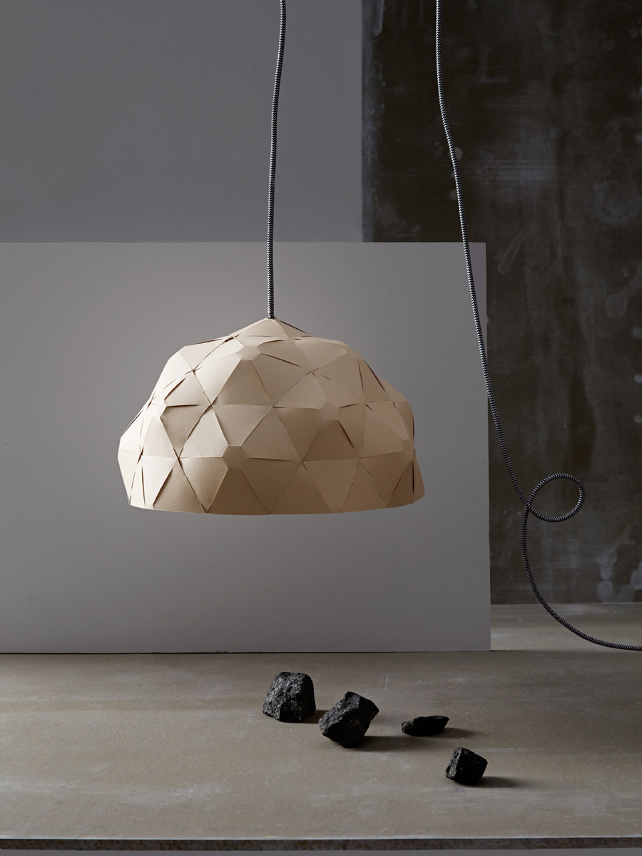
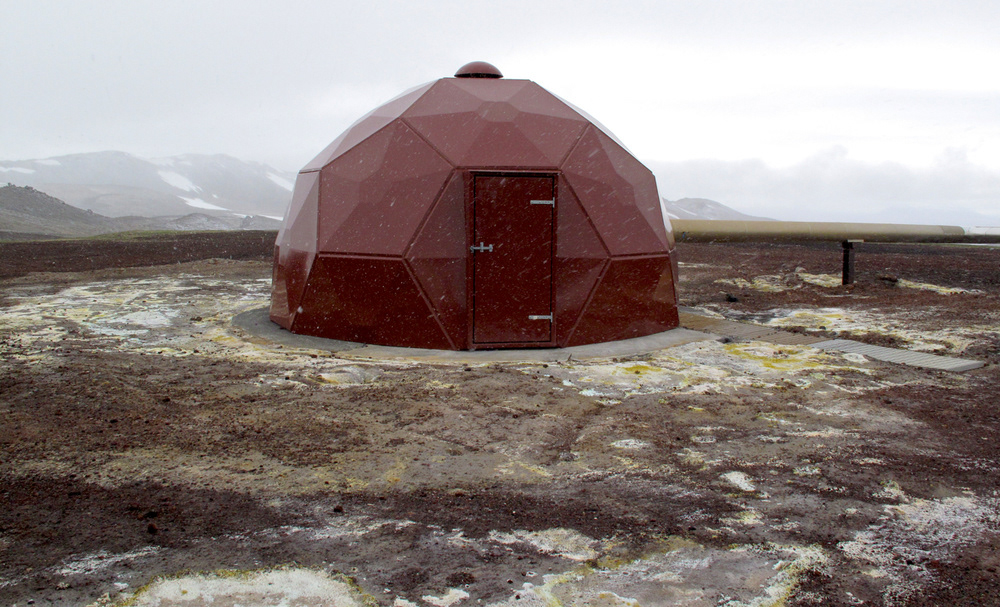
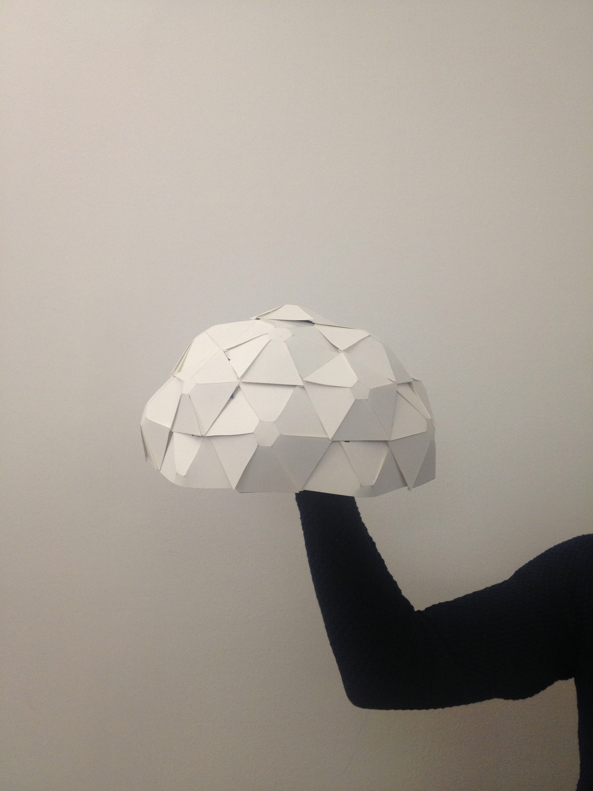
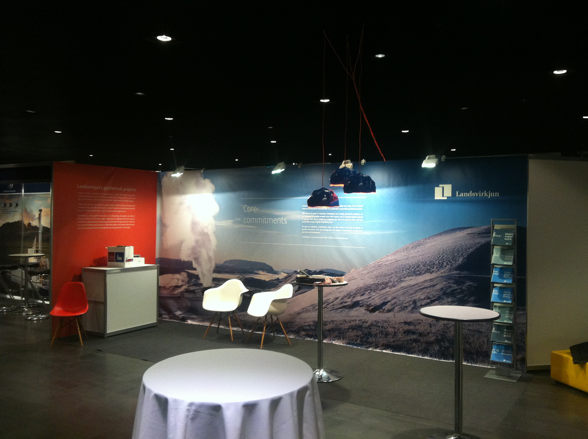
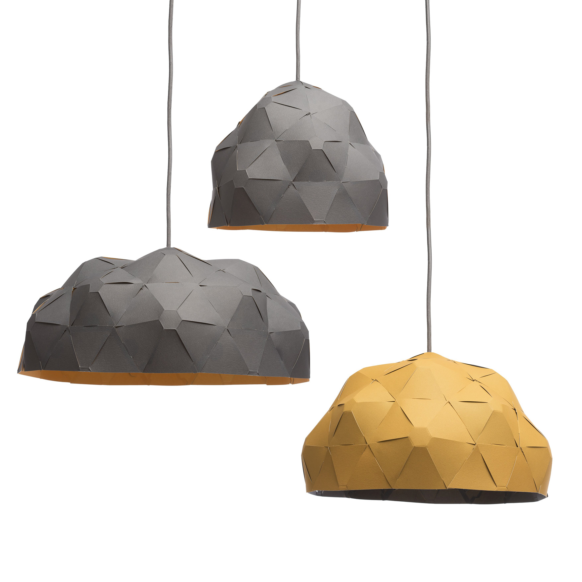
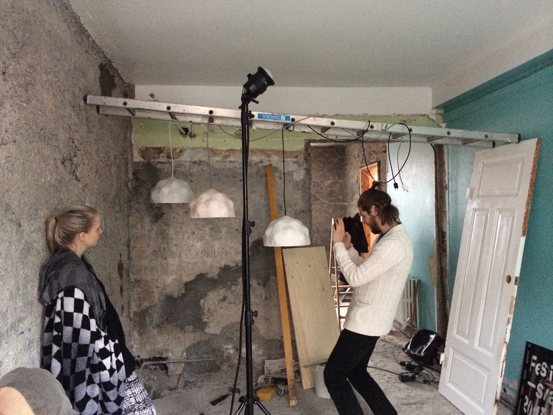
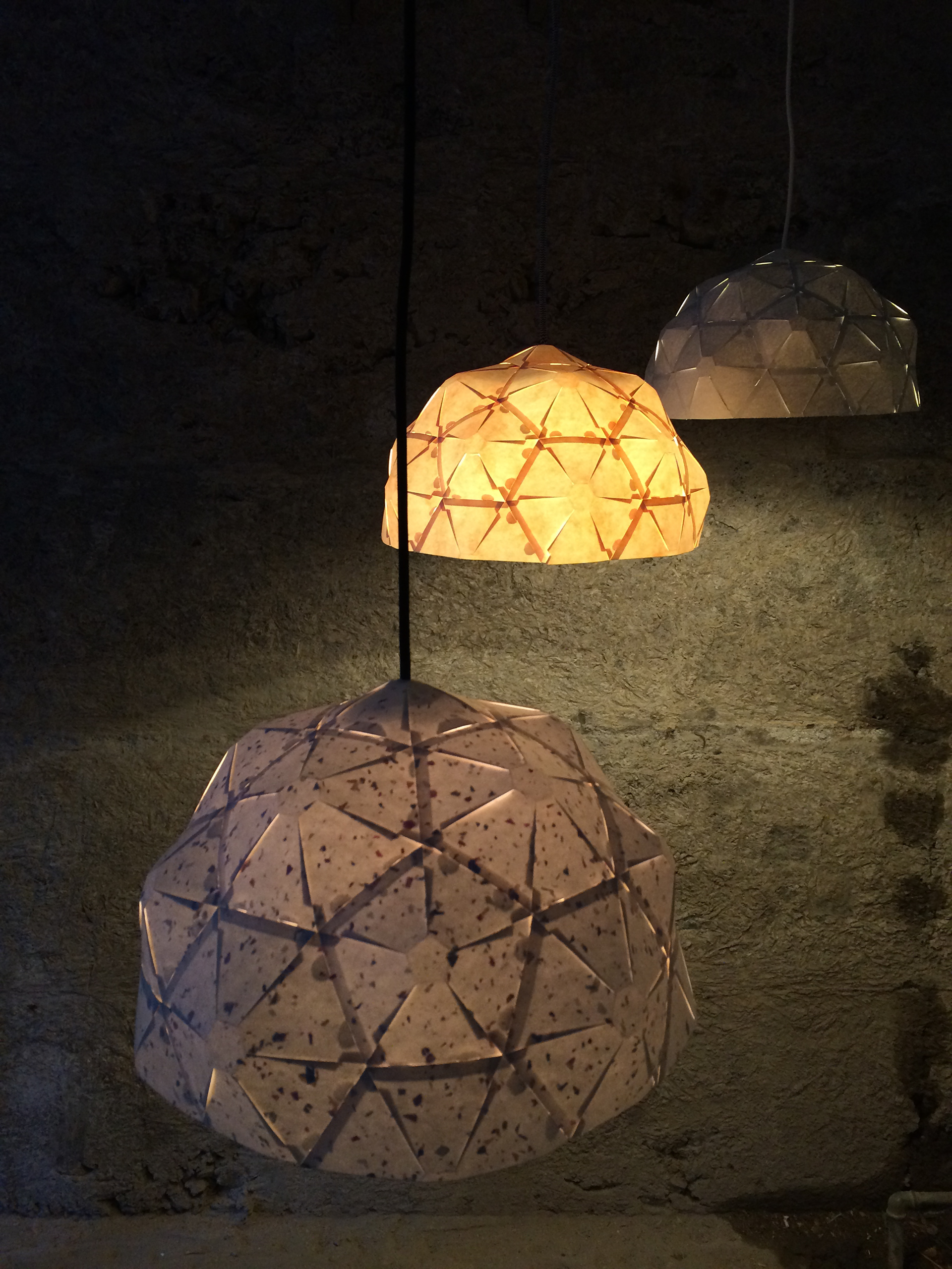
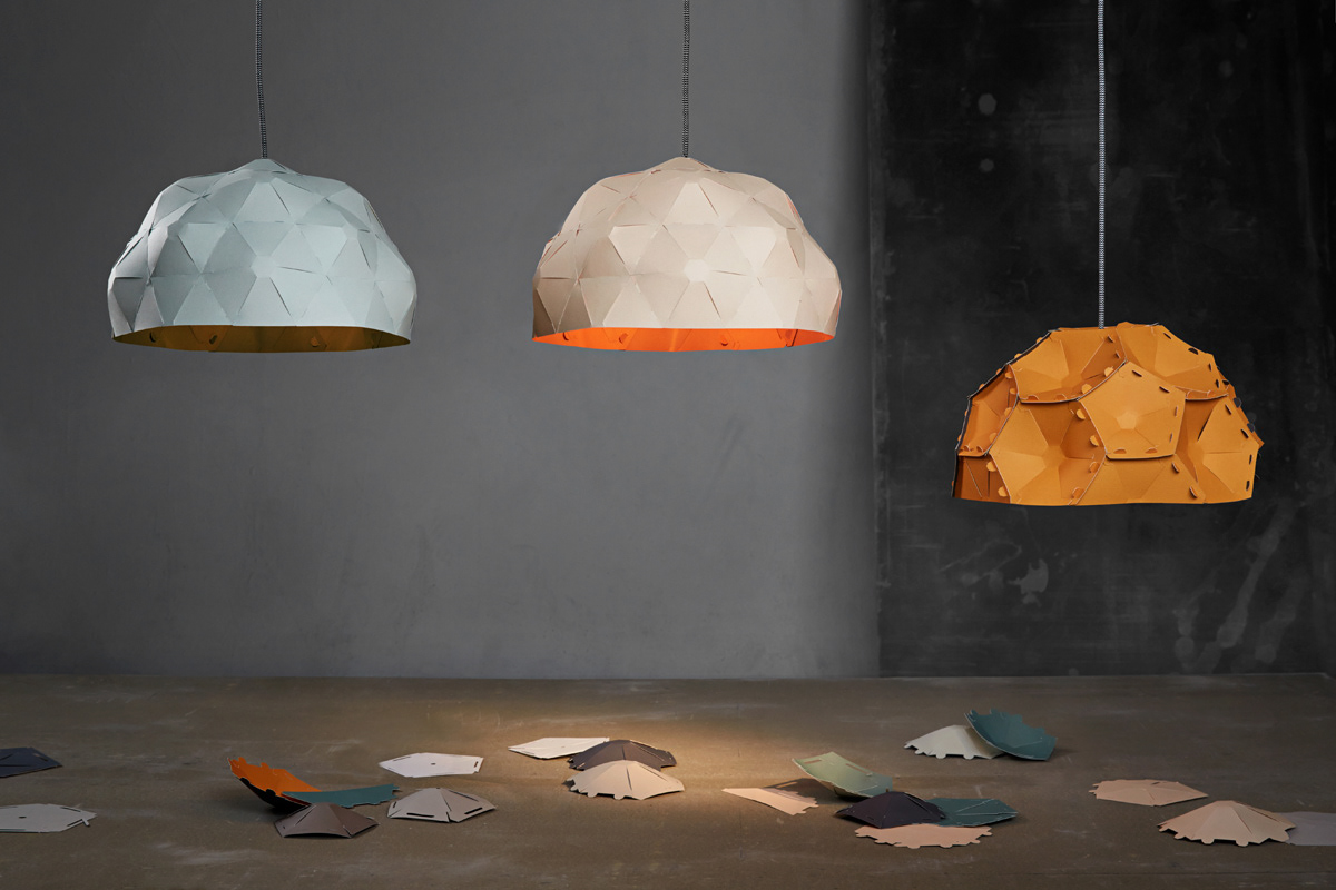
A light shade designed by me and Þorleifur Gunnar, working from under JL Ad Agency, for Landsvirkjun, made for a geothermal expo in Harpa (pic 4). The original shape of these light shades is adapted directly from Landsvirkjun’s dome shaped drillhouses (borholuhús - pic. 2) designed by architect Einar Þorsteinn in 1980.
After the expo me and Þorleifur decided to take this idea further and implemented it into the Selected by Bility project (which I mentioned in post 3/30).
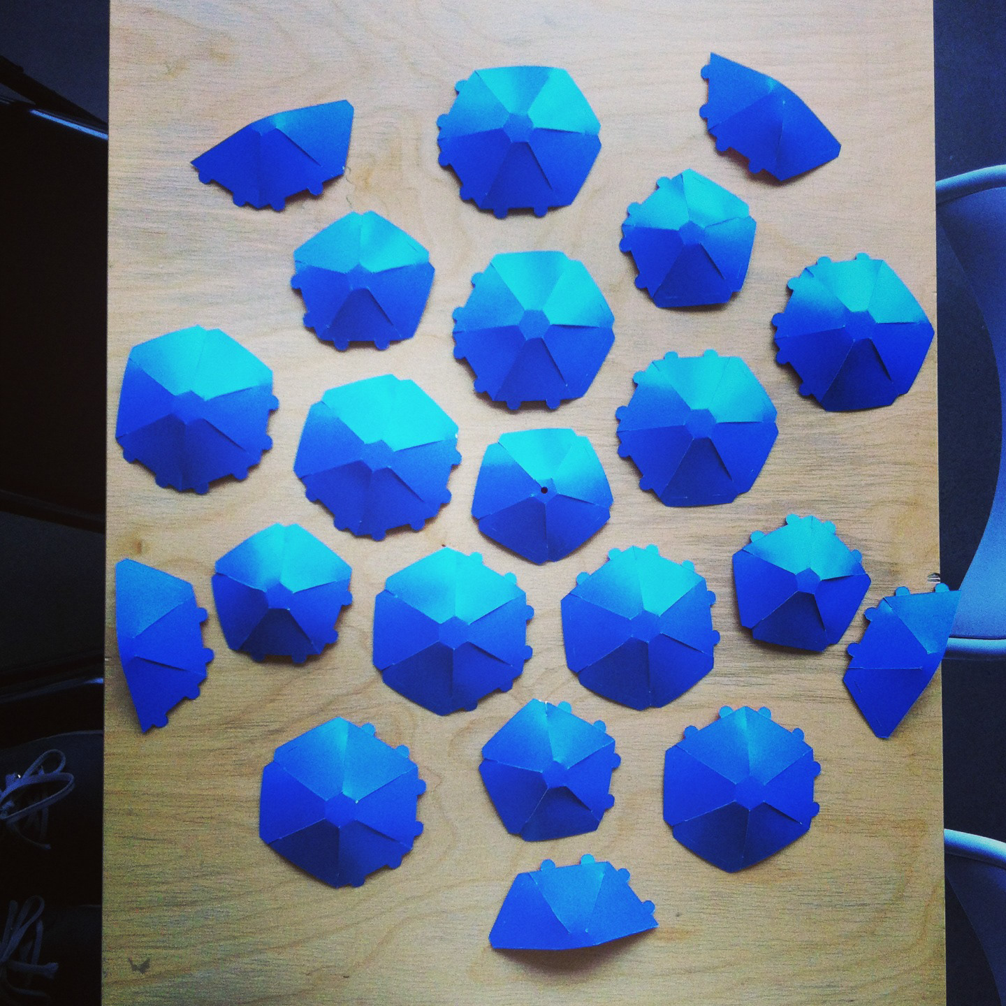
The light was made from paper, designed as a flatpack product for users to assemble themselves. Based on how many components you’d use, you could assemble different shapes of the light shade (pic 6). It was kind of a revelation to us that you could assemble different shades based on the different number of components used - as we figured that out completely out of coincidence - so all of a sudden we had light shades that fitted different circumstances.
We tried out a lot of variations both in assembly and materials. One of the most playful assemblies is probably the “inverted” one (seen on pic. 10).
We got our hands on sheets of paper to prototype with, that were made from discontinued money (possibly made from the Deutsche Mark - it’s in pic 8 & 9).
We got our hands on sheets of paper to prototype with, that were made from discontinued money (possibly made from the Deutsche Mark - it’s in pic 8 & 9).
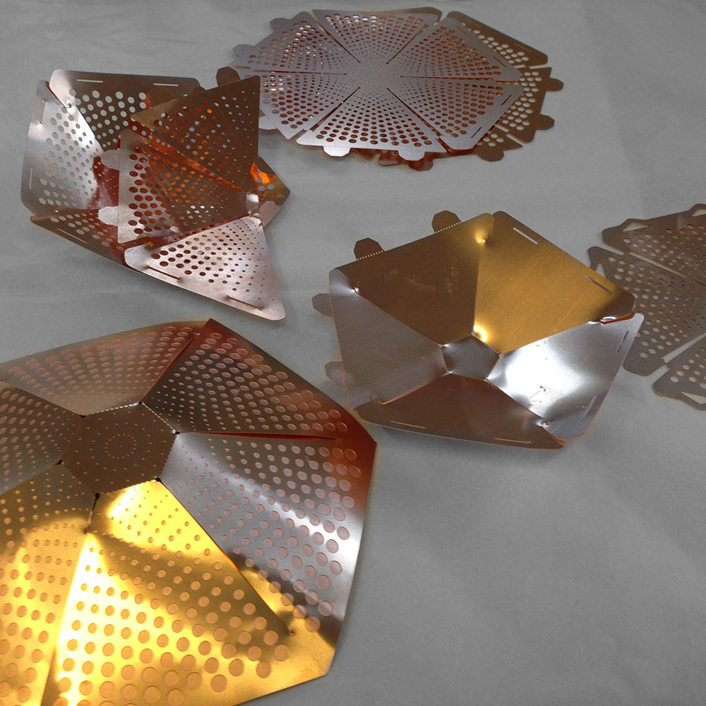
We tried making a copper version (which was way too hard to assemble - it’s in pic 7), and we had ideas about making a ceramic version (which we never did).
The original name for this light shade is Kafald, but as concepts develop the name Krafla was born. It comes from the Krafla-area in northern Iceland, as it was in this area that the first dome shaped drillhouse was put up. Additionally the colour scheme is inspired by the surrounding area.
These lights where showcased in many design exhibitions around the world and for a time they were a part of the Mathús restaurant in Keflavík Airport. Which reminds me: if a customer asks you to coat paper-lights in lacquer so they’ll be easier to clean, say no. Paper and lacquer do not go well together. Just like paper and water. The paper winds up and becomes.. well ugly. We learned that the hard way.
It has been on mine and Þorleifur’s schedule to revisit this light for many years, to simplify the manufacturing process and the user-assembly, plus adding new materials and colours. Maybe one day.
